Home

Improving Wayfinding at Dubai Airports
Improving Wayfinding at Dubai Airports
Improving Wayfinding at Dubai Airports
6 min est. read

Overview
Dubai Airports Express Maps served millions of commuters, visitors, and logistics users navigating one of the world's busiest airports. The existing experience felt outdated and unfamiliar, nothing like the mapping tools people use every day. Jacobs Law states that users spend most of their time on other platforms and expect yours to feel familiar. This didn't.
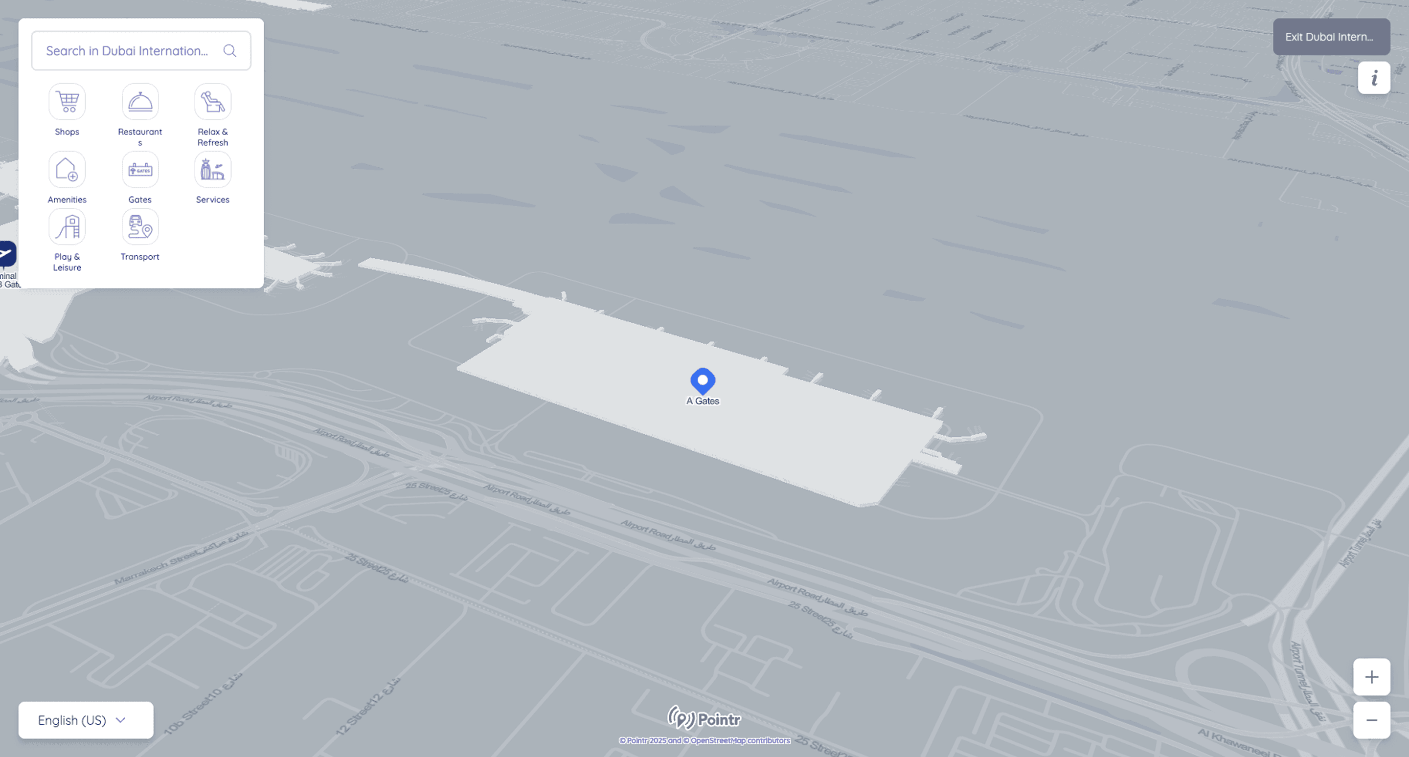
I led the visual and interaction direction for the experience layer built on top of Pointr, the mapping platform powering the map itself. The map background wasn't mine to change. Everything users interact with was.
Dubai Airports Express Maps served millions of commuters, visitors, and logistics users navigating one of the world's busiest airports. The existing experience felt outdated and unfamiliar, nothing like the mapping tools people use every day. Jacobs Law states that users spend most of their time on other platforms and expect yours to feel familiar. This didn't.
I led the visual and interaction direction for the experience layer built on top of Pointr, the mapping platform powering the map itself. The map background wasn't mine to change. Everything users interact with was.
My Role
Lead Designer
Responsibilities
Navigation Experience Direction
Timeline
Q2 2025
Outcomes
Outcomes
Faster Decisions
Faster Decisions
Stronger hierarchy and signal clarity made primary routes and key nodes immediately readable without scanning.
Stronger hierarchy and signal clarity made primary routes and key nodes immediately readable without scanning.
Less Cognitive Load
Less Cognitive Load
Competing visual elements were rebalanced so the most critical information surfaced first under pressure.
Competing visual elements were rebalanced so the most critical information surfaced first under pressure.
Cross Device Clarity
Cross Device Clarity
Color, typography, and contrast refined to work consistently across every screen size and use case.
Color, typography, and contrast refined to work consistently across every screen size and use case.
The Challenge
The existing experience had two core problems.
It felt like a different product entirely. Google Maps and Apple Maps have set the standard for how digital maps feel and behave. Express Maps didn't resemble either. For users navigating a high pressure environment like an airport, that unfamiliarity created friction at exactly the wrong moment.
The interaction layer was doing too much. Search results, category icons, filters, and information panels were all competing at the same visual weight. In a navigation context where users need to find something fast, visual competition slows everything down.
The existing experience felt unfamiliar and visually dense. Everything competed at the same weight.
Approach
Working Within Real Constraints
Working Within Real Constraints
The Pointr map in the background was fixed. I had no control over the map's visual look and feel, its satellite view, its rendering style. My scope was everything users interact with on top of it. Search, categories, results, selection states, transitions. That constraint made the work more focused, not less.
The Pointr map in the background was fixed. I had no control over the map's visual look and feel, its satellite view, its rendering style. My scope was everything users interact with on top of it. Search, categories, results, selection states, transitions. That constraint made the work more focused, not less.
Visual Hierarchy First
Visual Hierarchy First
Map elements were rebalanced so the most important information stood out immediately. Primary routes and key locations got stronger visual treatment. Secondary information receded. The goal was that a user looking for their gate could find it without scanning everything at equal weight.
Map elements were rebalanced so the most important information stood out immediately. Primary routes and key locations got stronger visual treatment. Secondary information receded. The goal was that a user looking for their gate could find it without scanning everything at equal weight.
Familiar Interaction Patterns
Familiar Interaction Patterns
Every interaction decision was made with familiarity in mind. Search behavior, result presentation, selection states, and transitions were all designed to feel like something users had used before. Reducing the learning curve in a high pressure navigation moment directly reduces cognitive load.
Every interaction decision was made with familiarity in mind. Search behavior, result presentation, selection states, and transitions were all designed to feel like something users had used before. Reducing the learning curve in a high pressure navigation moment directly reduces cognitive load.
A Demanding Client With High Standards
A Demanding Client With High Standards
DXB had specific expectations and the team anticipated significant pushback on the visual direction going in. There was none. The visual direction was approved without feedback. Questions focused on structure and journey flow, which we worked through together.
DXB had specific expectations and the team anticipated significant pushback on the visual direction going in. There was none. The visual direction was approved without feedback. Questions focused on structure and journey flow, which we worked through together.
Intent Based Entry
Intent Based Entry
When users open Express Maps they don't all need the same thing. An arriving passenger needs baggage and exits. A departing passenger needs gates and check in. Someone meeting a traveler needs arrivals information. We added an intent selection step at the start so the experience could orient itself around what the user actually came to do rather than making them figure it out themselves.
When users open Express Maps they don't all need the same thing. An arriving passenger needs baggage and exits. A departing passenger needs gates and check in. Someone meeting a traveler needs arrivals information. We added an intent selection step at the start so the experience could orient itself around what the user actually came to do rather than making them figure it out themselves.

Outcomes
Visual refinements across a navigation platform used by millions of commuters, visitors, and logistics users at one of the world's busiest airports. Route interpretation became faster, cross device readability improved, and cognitive load during navigation tasks was reduced by giving more important information stronger visual weight and letting secondary information recede.
Visual refinements across a navigation platform used by millions of commuters, visitors, and logistics users at one of the world's busiest airports. Route interpretation became faster, cross device readability improved, and cognitive load during navigation tasks was reduced by giving more important information stronger visual weight and letting secondary information recede.
Learnings
The most impactful decisions on this project were about what to remove rather than what to add. Reducing visual competition between elements made the same information easier to read without changing the underlying content. Restraint in a navigation context is not a stylistic choice, it is a functional one.
Working within constraints imposed by a third party platform focused the design effort in a useful way. When you can't change the map, you get very deliberate about everything sitting on top of it.
What Came Next
The Express Maps work identified a gap that went beyond visual refinement. The experience worked well for most users but had limitations for travelers with specific needs. Working proactively with our creative director we developed a dedicated accessibility focused maps experience for People of Determination, DXB's term for users with disabilities.
That work became a separate pitch and case study.
Read Case Study