Home
Designing A Wealth Management Institution's Digital Presence
Designing A Wealth Management Institution's Digital Presence
Designing A Wealth Management Institution's Digital Presence
7 min est. read
Overview
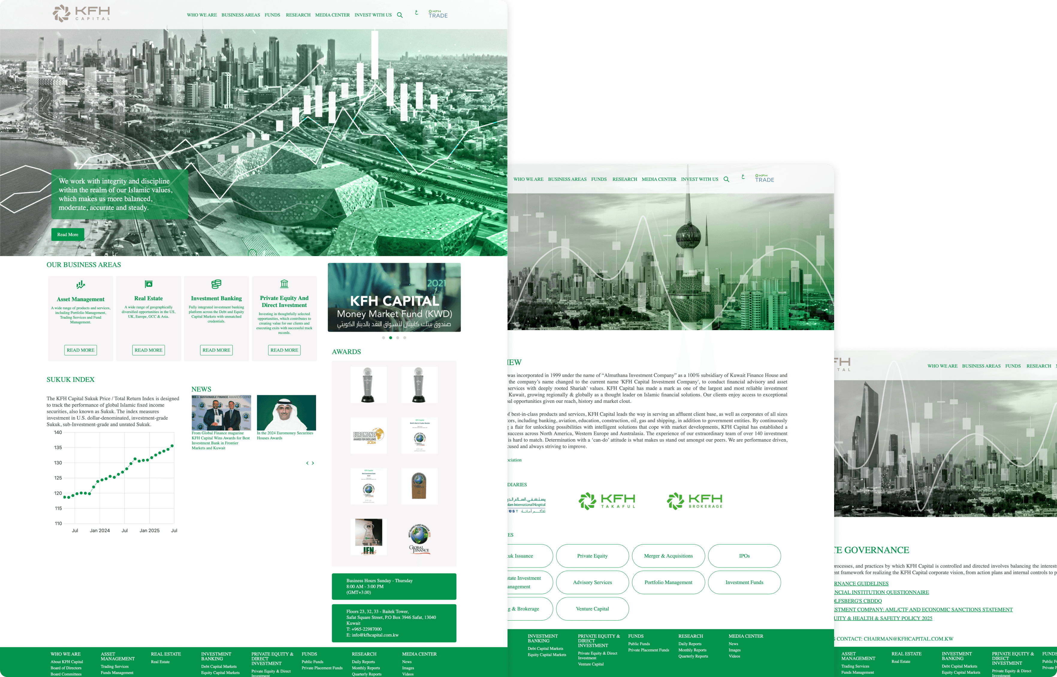
KFH Capital's existing website didn't reflect the institution behind it. A brand with decades of history, regional awards, and billions in assets under management was living inside a generic financial template. The visual language had more in common with a retail bank than a premium investment firm.
I led the visual and interaction direction to redesign the experience from the ground up, building a design system in parallel and delivering the full site in English and Arabic across desktop and mobile.
My Role
Lead Designer
Responsibilities
Experience Design
Design System
Timeline
Q1 2026
Outcomes
Outcomes
Board Presentation Requested
Board Presentation Requested
The CEO requested to present the work to the main KFH board before the site had even launched.
The CEO requested to present the work to the main KFH board before the site had even launched.
Designed To Win Awards
Designed To Win Awards
Once live, the team intends to submit the work for regional and international industry awards.
Once live, the team intends to submit the work for regional and international industry awards.
Regional Benchmark
Regional Benchmark
The team was confident the final direction would surpass NBK Wealth, the previous regional standard.
The team was confident the final direction would surpass NBK Wealth, the previous regional standard.
The Starting Point
KFH Capital is one of Kuwait's most established investment firms. Two decades of operation, Euromoney awards, billions in assets under management, clients spanning individuals and major institutions across the GCC.
Their website said none of this.
Generic stock photography, a flat green across every surface, inner pages that were text on white. The visual language was saying regional bank. The brand deserved to say institutional investment partner.
The Opportunity
KFH Capital had seen the work done previously on KFH Private, a premium banking platform the team described as radical and appreciated. KFH Capital was a more premium offering and the digital experience needed to reflect that.
The competitive benchmark was also clear from the start. NBK Wealth set the regional standard. KFH Capital wanted to surpass it.
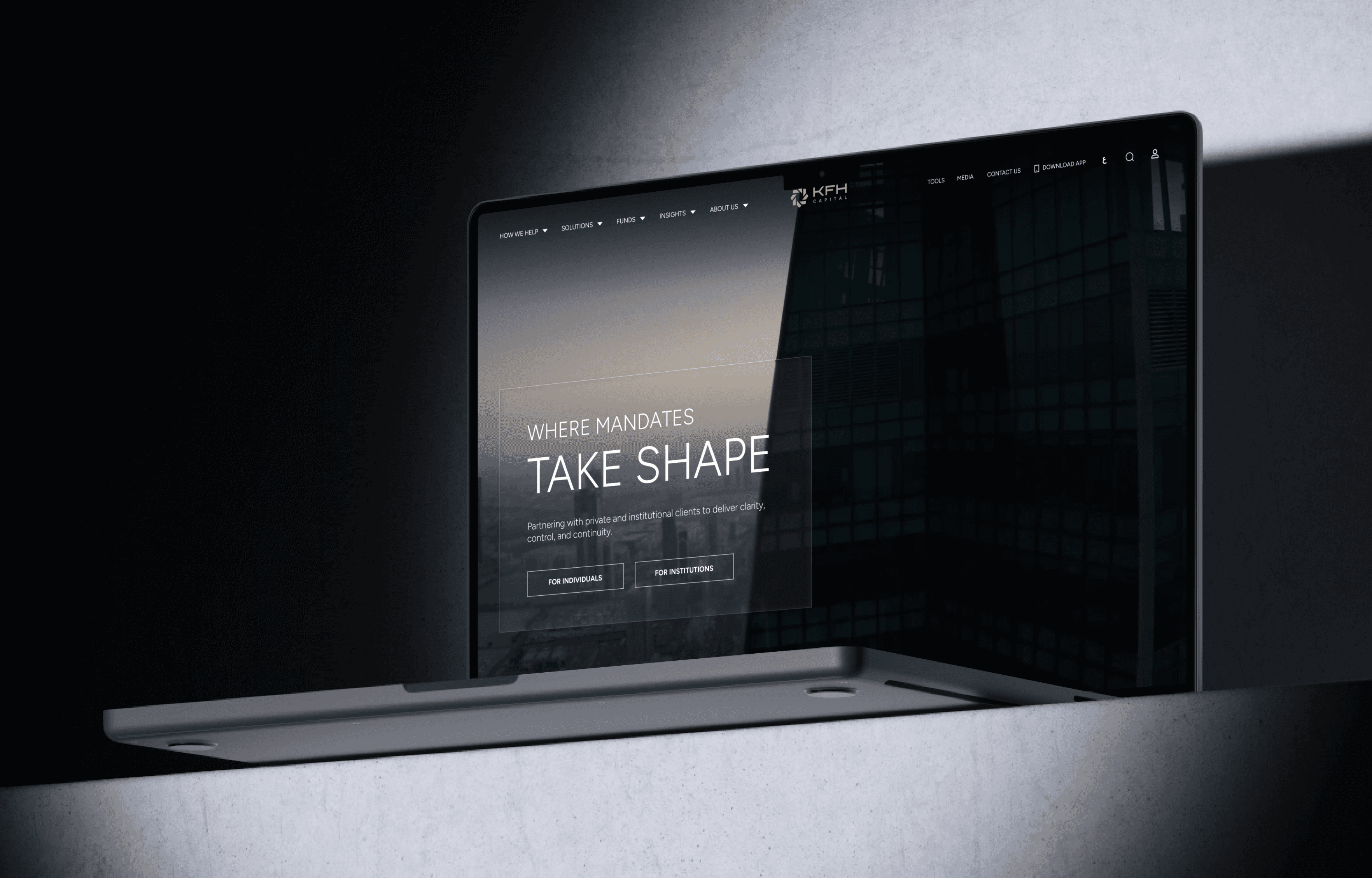
I approached the project with a proactive visual direction that hadn't been asked for, dark and cinematic, built around a 3D render of the KFH logo mark that stayed faithful to their approved 2D logo. It gave the brand depth and presence it had never had digitally. KFH Capital responded immediately and the project moved forward.
The 3D element was produced using AI tools, Meshy and ChatGPT image generation, rather than an external 3D resource. The quality was high enough that no external specialist was needed, which kept the process lean and the creative direction fully in house.
KFH Capital had seen the work done previously on KFH Private, a premium banking platform the team described as radical and appreciated. KFH Capital was a more premium offering and the digital experience needed to reflect that.
The competitive benchmark was also clear from the start. NBK Wealth set the regional standard. KFH Capital wanted to surpass it.
I approached the project with a proactive visual direction that hadn't been asked for, dark and cinematic, built around a 3D render of the KFH logo mark that stayed faithful to their approved 2D logo. It gave the brand depth and presence it had never had digitally. KFH Capital responded immediately and the project moved forward.
The 3D element was produced using AI tools, Meshy and ChatGPT image generation, rather than an external 3D resource. The quality was high enough that no external specialist was needed, which kept the process lean and the creative direction fully in house.
Two Concepts
I developed two visually distinct directions to explore the brief and pressure test what the brand could be.
Concept 1 was atmospheric. A warm gold 3D render of the KFH logo rotated slowly in the hero background, present but restrained. Liquid glass panels layered depth into the navigation. Cinematic, warm, premium.
During the development of Concept 2, there was internal pressure to incorporate a green from the broader KFH masterbrand. I advised against it. KFH Capital had its own distinct identity and introducing the masterbrand color would dilute the premium positioning the entire direction was built on. I could only push back so far in conversation, so I held the position in work instead. I prepared a version without the green proactively.
During the development of Concept 2, there was internal pressure to incorporate a green from the broader KFH masterbrand. I advised against it. KFH Capital had its own distinct identity and introducing the masterbrand color would dilute the premium positioning the entire direction was built on. I could only push back so far in conversation, so I held the position in work instead. I prepared a version without the green proactively.

When the team saw the green version they rejected it immediately. The version I had already prepared was the one they responded to.
Concept 2 was authoritative. The same logo in platinum, more visible throughout the scroll. Pure black background. Constellation charts and area graphs. Where Concept 1 whispered premium, Concept 2 stated it.
The Decision Neither Direction Could Make Alone
The response to both concepts was immediate. The CEO loved them equally and said it could go either way. A senior team member said he had never seen that response in his career.
Both concepts had captured something true about the brand. Concept 1 had the warmth of a wealth manager who had earned the right not to shout. Concept 2 had the authority of an institution operating across global markets. KFH Capital was both. Neither alone was the complete answer.
When the liquid glass navigation was revealed, the CEO connected it unprompted to Apple's design direction, noting it felt forward thinking and aligned with where the industry was heading.
After seeing both directions the team was confident they would surpass NBK Wealth. That was the benchmark they had set at the start.
The Final Direction
From Concept 2: the dark background and the authority it conveyed.
From Concept 1: the gold logo placed in the background rather than competing for attention. But the interaction shifted. In Concept 1 the logo rotated continuously. In the final direction it rotates on scroll. It only moves when you do.
The black and white photography with selective gold highlights came from observation rather than a mood board. A team member had visited KFH Capital's Kuwait office and noticed this exact visual treatment on their walls. We took what the brand already believed about itself and built it into the digital experience. The team loved it immediately.
Liquid glass carried through unchanged. It was the element the CEO had connected to most strongly and it became the defining interaction language across the entire site.
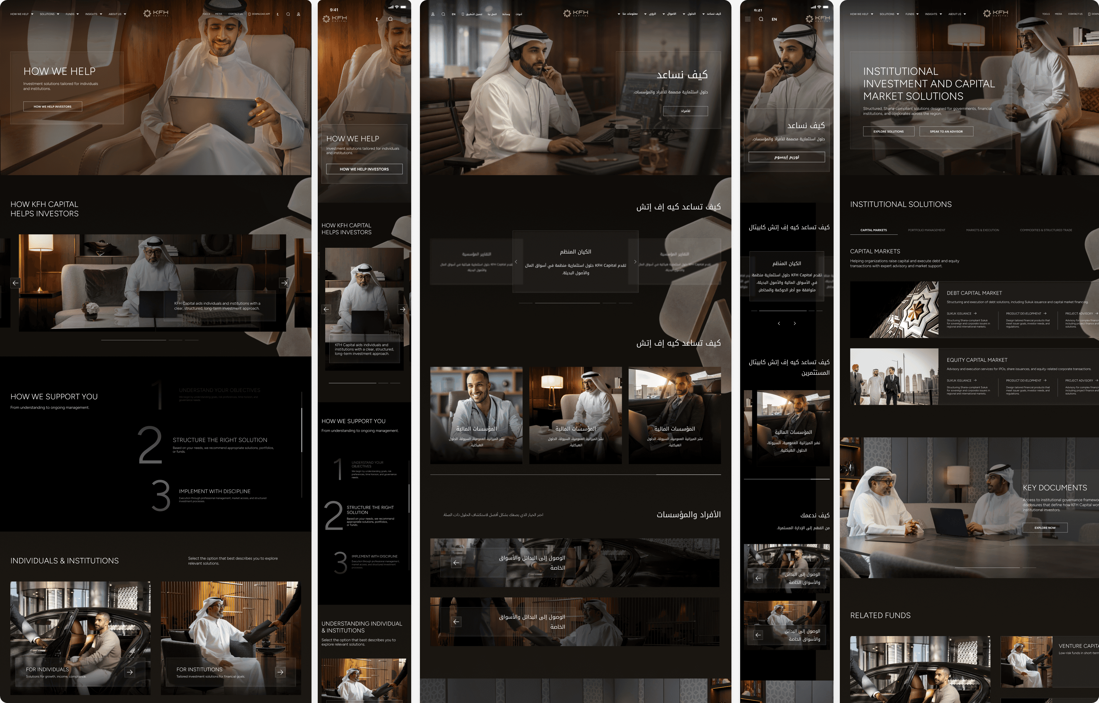
The Inner Pages
Before seeing any inner pages, the team raised a specific concern: most designers get the homepage right and lose the thread on inner pages.
When the inner page direction was presented, they loved it on first sight.
The design language carried through completely, dark background, warm photography, consistent typographic hierarchy. A conscious decision was made to keep inner page interactions lighter than the homepage to protect performance. Content heavy pages needed to be fast and reliable. The bilingual delivery extended through every inner page at equal quality, English and Arabic fully mirrored with RTL layouts built to the same standard.
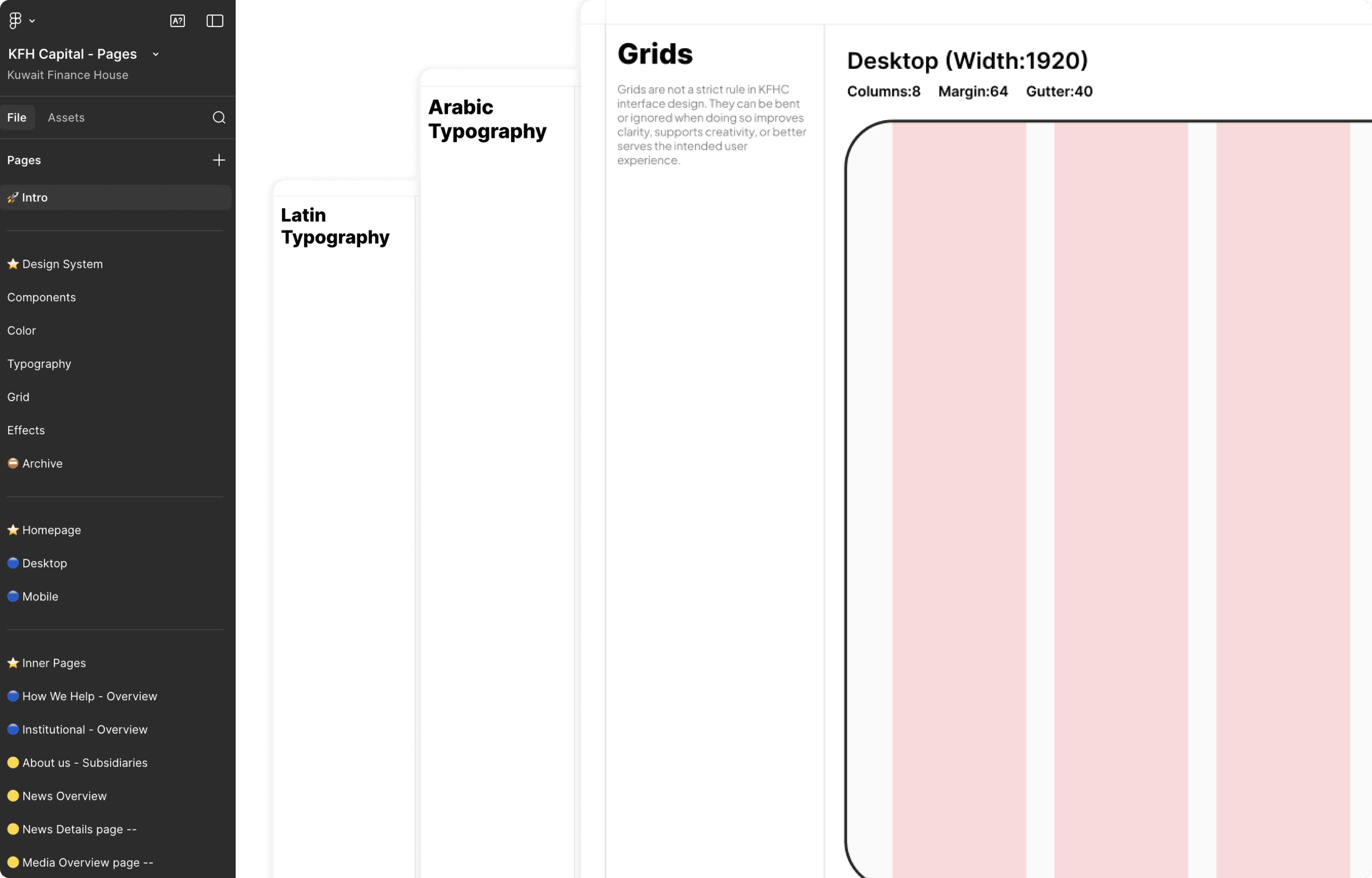
The System Behind The Scale
33 pages. English and Arabic. Desktop and mobile. 66 total deliverables.
The design system was built in parallel with the work. Typography and tokens were defined early, Figtree for Latin, Noto Kufi Arabic for Arabic, both fully documented. Liquid glass codified as a named effect. Tokens defined across color, spacing, and type.
The token structure proved its value under pressure. When the team wanted to see a variation during a review call, it was mocked up before the call ended. Without the system that would have required a follow up. The delivery speed across 66 deliverables was directly enabled by it. The same scope without the system would have required significantly more time and resource.
The developers, seeing the Figma file for the first time, asked how the level of interactivity in the concepts and final direction was even possible.
Outcomes
The CEO requested to present the work to the main KFH board, to showcase what had been built and open conversations with other divisions about what was possible for them. The design became a tool for expanding the scope of the work before it had even launched.
Once live, the team intends to submit it for industry awards. That is not a detail about design quality. It is a statement about how they feel about what was built.
Tradeoffs
The homepage was built to be motion forward but I made the decision to dial interactions back significantly on inner pages. Fast and reliable on content heavy pages matters more than visual spectacle. Concept 1 had the logo rotating continuously which felt atmospheric but distracting. Concept 2's scroll responsive approach was the right call, the brand moves when you engage with it rather than performing in the background regardless of what the user is doing. Building the design system in parallel rather than after created short term friction but meant consistency across 66 deliverables was structural, and when a live variation was needed on a call it took minutes rather than a follow up because the tokens were already defined in Figma.
The homepage was built to be motion forward but I made the decision to dial interactions back significantly on inner pages. Fast and reliable on content heavy pages matters more than visual spectacle. Concept 1 had the logo rotating continuously which felt atmospheric but distracting. Concept 2's scroll responsive approach was the right call, the brand moves when you engage with it rather than performing in the background regardless of what the user is doing. Building the design system in parallel rather than after created short term friction but meant consistency across 66 deliverables was structural, and when a live variation was needed on a call it took minutes rather than a follow up because the tokens were already defined in Figma.
Learnings
When there was internal pressure to include a color that didn't belong to KFH Capital's identity, I prepared an alternative proactively rather than debating it. When the team rejected the direction I had advised against, the right version was already ready. Preparing is sometimes better than arguing.
Two strong concepts don't create indecision, they create clarity. Presenting two genuinely distinct directions could have confused the team. Instead it produced a synthesis neither direction could have reached alone.
A design system built in parallel pays off in moments you can't plan for. Defining tokens and typography early meant that when the team asked to see a variation live on a call, it was possible before the call ended.